
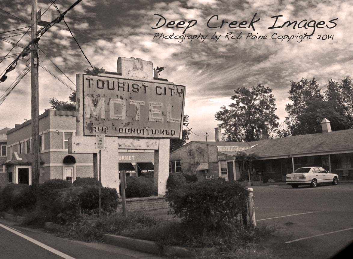
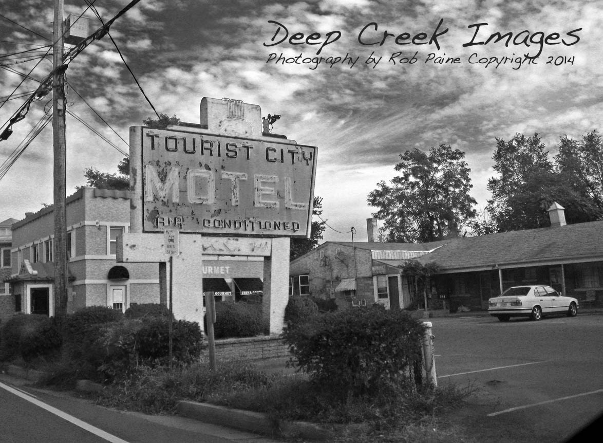
Some of my favorite objects to photograph are old motel signs. I shot this photo from a car window with a pocket Canon digital a few years ago while traveling through Winchester, Va. The sign had a some cool colors and textures so I decided to have some fun with it in post processing. (please see different variations on this image and additional text below)

When working with students starting to learn any type of photo software, whether it be Adobe Elements, Apple iPhoto or Adobe Photoshop, I always urge people to take a prudent approach. These pieces of software used in moderation can really improve your images. Used without such restraint your images will look fake, over processed and in some cases, unusable.
How small will you go when downsizing your living space? Check out my post of Blue Moon Rising to see a small home eco vacation destination.
Of course rules are made to be broken and these photos are a result of flying off the straight and narrow path.
These photos offer a totally opposite extreme approach. For me, there is not much middle ground in post processing. If I am trying to stay with a realistic look such as when photographing a nature scene or a news event, I usually limit my editing to cropping, so mild toning, adjustment of curves, etc.
But if I am clearly going for a more modern or artsy look all bets are off. I find it fun to take one photo that includes a variety of colors and shapes and textures like this one and
run it through as many effects of Photoshop as I can find. Sometimes I might end up with a single image and other times I might find it appealing to present the variations as a series as I did on this grouping.

The one tool I always exercise the most restraint with though is the sharpening tool. If a photo is over sharpened it can really wreck the image, especially if you are posting it on a Web site or emailing it to someone else. Vignetting is also something that I have seen a lot of people go overboard with.
I think the key is no matter if you are taking a less is more approach or breaking the rules, be sure that every change you make to a photo has a purpose for the statement you are trying to make or for the story you are attempting to tell.
Thanks so much for visiting my blog today, Rob


#2
LikeLike
thank you for voting
LikeLike
I like the top one ….. great entry to the challenge .. and that is the same object but in multi variations. Rob, great job again. *smile
LikeLike
These are neat. I’m a fan of old signs too, maybe even obsessed with them here in Austin, where we also have new signs made to look old. It’s a thriving cottage industry here, in fact.
LikeLike
thanks Jann for the comment. That is really cool. I know when I see old signs at antique shops they usually are pretty pricey and sell well. I guess that makes a lot of sense that there would be a market for building old signs.
LikeLike
Yes, retro is the big thing here! Nice to see that what’s old is valued by many of us, instead of always going for the shiny new thing. Enjoying your blog!
LikeLike
I love them all, Rob
LikeLike